

Lesson 3 - Planes and Head Construction
In lesson three of the portrait prep series, I'm going to give an overview of Planes and Head Construction. We’ll be using the Asaro head, the Reilly method, and the Loomis method. (No clue what that means? No problem! I’ll explain in a second.)
Head construction is so important because it in involves the entire head -- not just an isolated look at the face, or the sides of the face, or just features. It provides you with a framework which you can build upon. This as the final puzzle piece that enables you to begin your journey in drawing portraits!
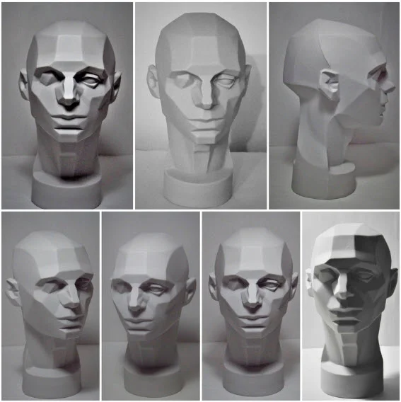
The Asaro Head
The first method to discuss is the Asaro head. I know of no better way to understand the shading of the head than this model. This is a 3-D model of the head created by John Asaro and helps our overall understanding of how light is reflected on the surfaces of the head.
When we study portraiture, we are learning the exaggerated planes and angles of an object that we often think of as round or spherical. Together we can practice looking at the model head (even if we’re just using a reference photo of the head) and draw it from our point of view.
Asaro Head Exercise
Study the images in the graphic below and notice how the light in reflected on each plane of the head.
Key things to look for in this challenge:
1. How many light sources are there?
2. Where is the light source?
3. Can you determine (and label) the value of each plane from 1 to 10?
4. How many planes are represented within each feature?
Head Construction Methods
There are two methods that are most popular for constructing the head: the Loomis method, and the Reilly abstraction method.
Someone may ask the question: Why should I learn methods for how to construct the head? Can’t I just copy from a photo instead?
Head drawing methods are giving you two essential benefits a photo can never provide:
1. The relationship of the features. (All the features are interconnected and have a relationship to each other.)
2. A way to label what you see. We're talking about a vocabulary and a language for something otherwise undefined. If something is undefined, then it’s abstract and can remain elusive. As realists, we can’t draw something we can’t see or define.
The best ways to learn head construction is to keep practicing it. Practice the things you learn often and keep pushing yourself and you WILL see results.
So with that backdrop, let's dig in!
Practicing the Loomis Method
The Loomis method is explained in detail in Andrew Loomis’s book, “Drawing The Head and the Hands”. It’s a free ebook and can be found on google easily (you can go here: Loomis Book). Refer to the images below the steps from the Loomis book.
These are the basic steps that we want to keep in mind for our purposes in portraiture:
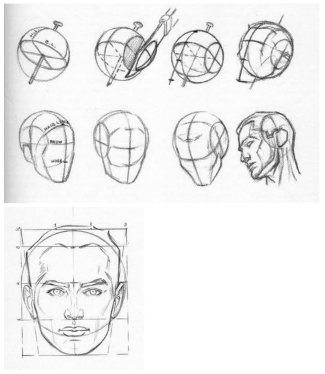
Draw a round ball.
Draw a vertical middle line (middle of the nose).
Draw a horizontal middle line (middle of the brow).
With an imaginary knife cut off the sides of each of the ball to represent the side plane of the head. (The top part of the circle is 2/3 of the height from the middle of the circle. This is also where the hairline should be. The bottom part of the circle represents the bottom of the ear and is the same plane for the bottom of the nose.) You will also have to determine where the circle curves at the side plane of the face.
Determine the angle of the side plane by making the line from the ear to the brow.
Then extend the line to the front plane.
Then render the lower and upper lines parallel to the middle line. This will give you the thirds of the face: hairline to brow line, brow line to base of the nose, base of the nose to bottom of the chin.
So next draw the bottom of the chin line. Extend the line (create a box like shape) and draw the jawline.
Find the eyes by placing your mark half way between the top of the head and the bottom of the chin.
The bottom of the bottom lip is halfway between the base of the nose and the bottom of the chin.
The Reilly Head Abstraction
Nothing is written down from Frank Reilly. We have very few writings from his students. I think that there are things we can learn from the Riley method. But mostly we're relying on what his students wrote about this method and what these students and then students of the students were able to communicate about the method.
One thing the Riley method incorporates well is a rhythmical relationship of the features in the head and face. So every feature has a relationship with the rest of the features. You could almost use one continuous line without Ever Lifting your pencil from the paper to create all of the rhythms in the face.
So really the best way to explain this particular method is to show you in a video I've prepared and you can look at the reference that I'm picturing here below.
For those that sign up for the Portrait Prep Drawing Course, You’ll have access to the video lessons. If you’d like to sign up for the course, go here to sign up! We’re starting the course on June 1, 2020.
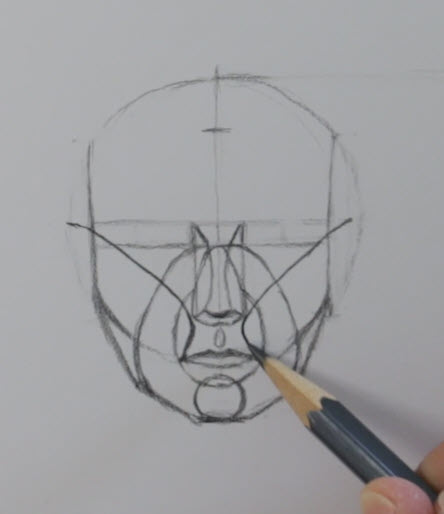
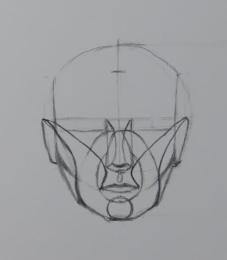
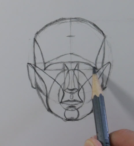
To begin the Riley method you need to have the outline of the head complete. So it doesn't really matter what method you use to create the head you just need to have the top of the head bottom of the chin in order to fill in the Reilly abstraction Rhythm lines.
1. Start with creating a round circle with the vertical and horizontal line in the frontal view.

2. Next move down one-third of the way from the middle of the circle that you created to create the bottom of the chin. This establishes the 3 divisions of the head.

3. Once you have the head outlined and know where the eyes are in relation to the brow line, you can move to the nose.

4. The nose is the width of the eyes.
5. Make the upper line to establish the ball of the nose.

6. Make the line where the keystone is, then add the curved line on each side to connect the keystone to the ball of the nose.
7. Add 2 curved lines from the keystone, to the base of the nose.

8. Create the muzzle of the mouth line by starting at where the intersection of the side plane crosses the vertical lines that were extended from the corners of the eyes.

9. Create the band of the face, or laugh line area, by starting at the keystone again and completing that curve with the jaw line.

10. The chin line extends from the bottom of the chin and intersects with the muzzle.

11. The mouth is identified by the intersection that just happened with the chin and muzzle.

12. Establish the cheek bone area (which should already be showing from our circle earlier).

13. Draw the rhythm line from corner of the mouth, pass by the corner of the nose to the side plane of the head where the brow ridge is. This is the helps establish the upper cheek area.
14. Start from the top of that rhythm that you just created and fill in the underside of the cheek.
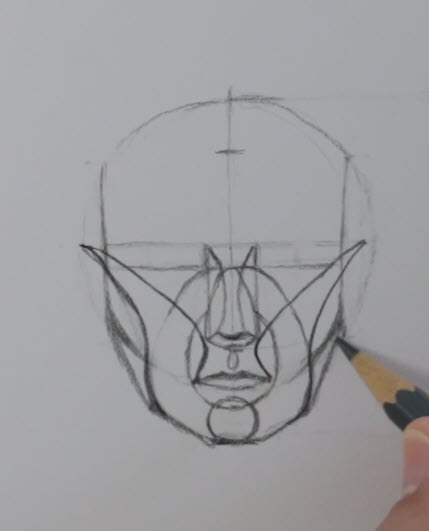
15. Next, connect the ears from the cheek line that you just created to the base of the nose plane.
16. Draw the side plane of the face on the forehead using the placement of outer area for the eyes and cheek as a guide for connecting this line.

17. Now you can add the curved brow line.

18. And finally, the eye curved line.
19. You could also add the eye placement as more detail.

Bonus: The John Middick Method
Okay, okay, so I’m not presumptuous enough to think that anyone is going to name an entire method after me. But I do think it’s beneficial to share some of the steps I take when doing my own head constructions!
I like to always consider where the head tilt is with each portrait I do. To do this, I think of 3 axes for the direction and location of the head in space:
1. The x-axes is measured by a line across the pupils. If the line isn’t level then the head is tilted. This is a better measurement than slant of eyes or eyelids.
2. The centerline down the nose, mouth, and chin. If this line is not perfectly centered in that y axis area then the head is angled or rotated to the right or left. Questions to ask: Do I see more of one nostril than the other? More of one ear? Is one of the corners of the eye behind the nose?
3. The position of the chin. Where is your eye level position: up or down? Is the bottom plane of the jaw seen? Do I see the underside of the plane of the nose or the hairline? These are all clues about the head rotation.
If you can answer these questions then you can begin to understand the tilt of your portrait subject better. You’ll know how to think about the subject more in a 3 dimensional way.